ShopDreamUp AI ArtDreamUp

Deviation Actions


Suggested Deviants


Suggested Collections


![[GoT] Sansa Stark](https://images-wixmp-ed30a86b8c4ca887773594c2.wixmp.com/f/7d7fe26a-6773-414b-879f-5c6157013598/d4z5qqe-ec29c89d-f370-4e50-b18d-2d10193286dd.jpg/v1/crop/w_184,h_184,x_0,y_12,scl_0.092,q_70,strp/_got__sansa_stark_by_anendlessvanity_d4z5qqe-92s-2x.jpg?token=eyJ0eXAiOiJKV1QiLCJhbGciOiJIUzI1NiJ9.eyJzdWIiOiJ1cm46YXBwOjdlMGQxODg5ODIyNjQzNzNhNWYwZDQxNWVhMGQyNmUwIiwiaXNzIjoidXJuOmFwcDo3ZTBkMTg4OTgyMjY0MzczYTVmMGQ0MTVlYTBkMjZlMCIsIm9iaiI6W1t7ImhlaWdodCI6Ijw9MTEyNSIsInBhdGgiOiJcL2ZcLzdkN2ZlMjZhLTY3NzMtNDE0Yi04NzlmLTVjNjE1NzAxMzU5OFwvZDR6NXFxZS1lYzI5Yzg5ZC1mMzcwLTRlNTAtYjE4ZC0yZDEwMTkzMjg2ZGQuanBnIiwid2lkdGgiOiI8PTkwMCJ9XV0sImF1ZCI6WyJ1cm46c2VydmljZTppbWFnZS5vcGVyYXRpb25zIl19.3iyxRjSluFOFQVj9ir14F05MkGcr79AmGrgZSjccGa4)
![[GoT] Sansa Stark](https://images-wixmp-ed30a86b8c4ca887773594c2.wixmp.com/f/7d7fe26a-6773-414b-879f-5c6157013598/d4z5qqe-ec29c89d-f370-4e50-b18d-2d10193286dd.jpg/v1/crop/w_92,h_92,x_0,y_6,scl_0.046,q_70,strp/_got__sansa_stark_by_anendlessvanity_d4z5qqe-92s.jpg?token=eyJ0eXAiOiJKV1QiLCJhbGciOiJIUzI1NiJ9.eyJzdWIiOiJ1cm46YXBwOjdlMGQxODg5ODIyNjQzNzNhNWYwZDQxNWVhMGQyNmUwIiwiaXNzIjoidXJuOmFwcDo3ZTBkMTg4OTgyMjY0MzczYTVmMGQ0MTVlYTBkMjZlMCIsIm9iaiI6W1t7ImhlaWdodCI6Ijw9MTEyNSIsInBhdGgiOiJcL2ZcLzdkN2ZlMjZhLTY3NzMtNDE0Yi04NzlmLTVjNjE1NzAxMzU5OFwvZDR6NXFxZS1lYzI5Yzg5ZC1mMzcwLTRlNTAtYjE4ZC0yZDEwMTkzMjg2ZGQuanBnIiwid2lkdGgiOiI8PTkwMCJ9XV0sImF1ZCI6WyJ1cm46c2VydmljZTppbWFnZS5vcGVyYXRpb25zIl19.3iyxRjSluFOFQVj9ir14F05MkGcr79AmGrgZSjccGa4)


You Might Like…


Featured in Groups


Description
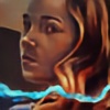
Sansaaaaaaaaa<3 Will update info and everything later today!
Edit: So, here is my second finished Sansa portrait! I don't know what is it about her that makes me want to paint her pretty much in every GoT scene! She is super beautiful in the new ep too! I hope this doesn't count as a spoiler") Btw, if her darker side of he face appears too dark I guess either my monitor calibration is bad or yours
Btw, if her darker side of he face appears too dark I guess either my monitor calibration is bad or yours
Done in PS CS6 with a Wacom Bamboo tablet
Prints and other products will soon be available in my Society6 Shop (Smile)")
Edit:
Society6
Instagram Tumblr
More of my ASoIaF art -
:origin()/pre06/025c/th/pre/i/2015/223/7/5/to_porcelain__to_ivory__to_steel_by_sacrilence-d8ytu97.jpg)
:origin()/pre06/25dd/th/pre/i/2016/102/0/6/a_dance_with_dragons_by_sacrilence-d9umbv5.jpg)
:origin()/pre08/584f/th/pre/i/2015/199/1/1/breaker_of_chains_by_sacrilence-d91ul2p.jpg)
Edit: So, here is my second finished Sansa portrait! I don't know what is it about her that makes me want to paint her pretty much in every GoT scene! She is super beautiful in the new ep too! I hope this doesn't count as a spoiler
Done in PS CS6 with a Wacom Bamboo tablet
Prints and other products will soon be available in my Society6 Shop
Edit:
Society6
Instagram Tumblr
More of my ASoIaF art -
Image size
8400x10500px 44.9 MB
© 2016 - 2024 Sacrilence
Comments20
Join the community to add your comment. Already a deviant? Log In
My first overall impression is that this piece looks really good. I love the atmosphere, I love the colors you use and I think you've captured her cautious expression very well.
The first thing I noticed that might need improvement is the hair. The skin looks great, really does look like skin, but the hair doesn't quite look like hair. The strands on top of the head look far too thick. Adding a little bit of definition here and there could help, while at the same time making sure it looks like a whole, basically.
The throat is the other thing that stands out a bit. I think the center of it needs to come forward a little more. There isn't quite enough suggestion of roundness and her sternocleidomastoids, the muscles that run all the way from below the ear to the clavicles, look a bit too pronounced, especially on the right side of the drawing.